
Brand guidelines
The official reference for using the H.R.A visual identity.
Brand story & meaning
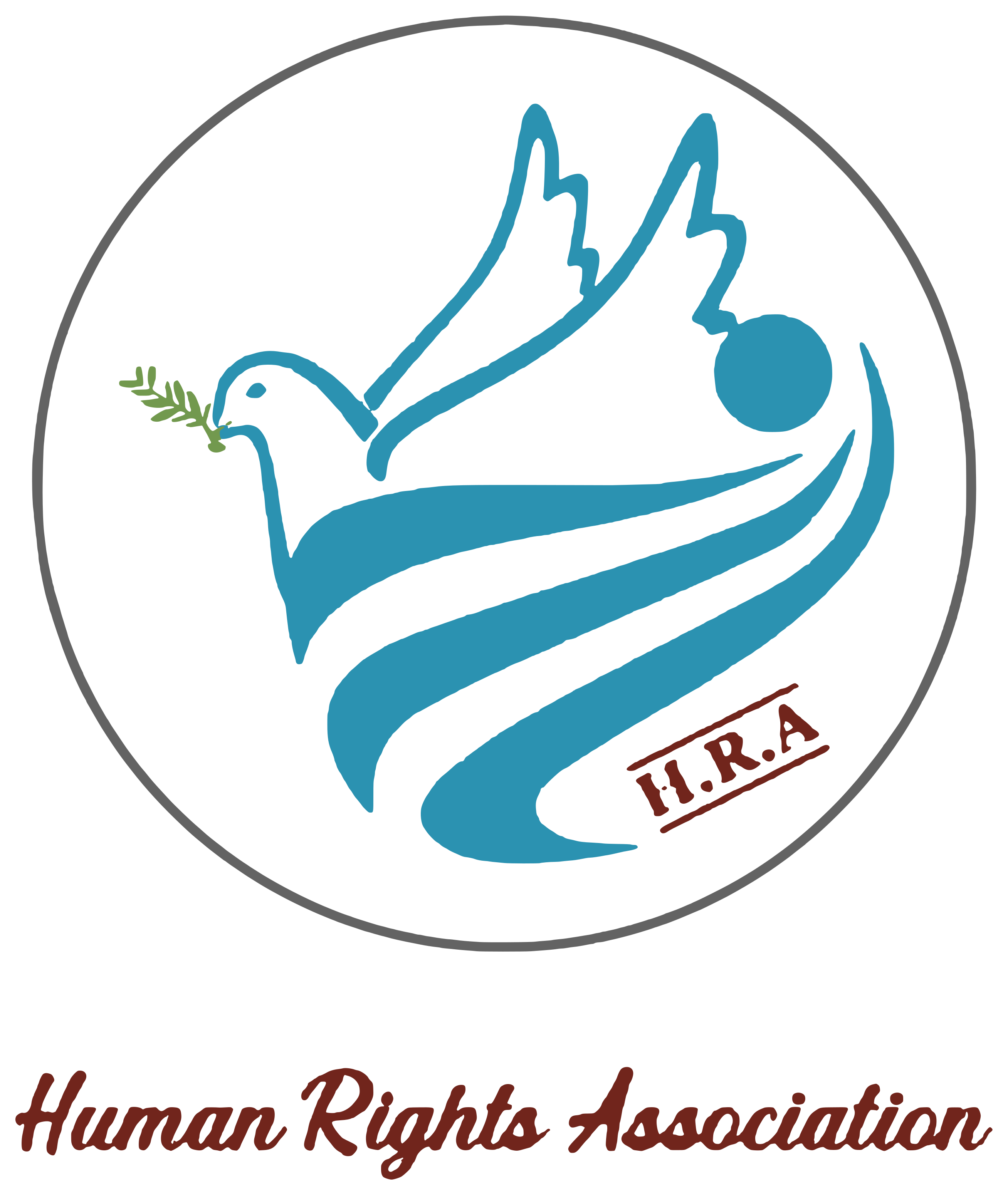
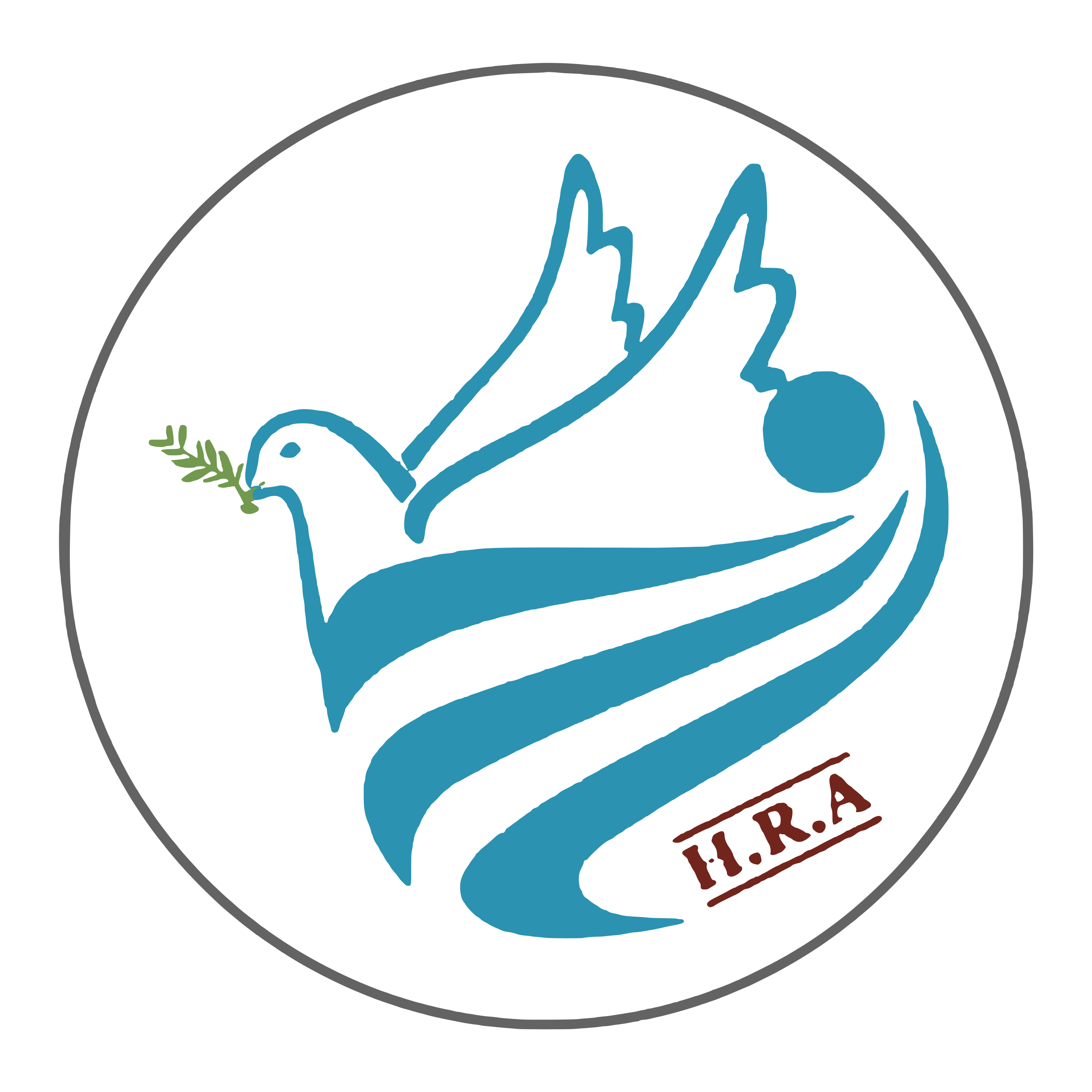
A dove carrying an olive branch
The blue dove with raised wings expresses peace and hope; the green olive branch, humanity and reconciliation; the flowing waves, protection and care; and the red H.R.A seal, law and accountability.
- Humanity
- Justice
- Peace
- Dignity
- Law
- Hope
Core rule
The logo is a fixed master asset. All versions derive from the original artwork without redrawing; never alter its proportions, colours or elements.

Clear space
Keep clear space around the logo at least equal to the height of the H.R.A seal (≈15% of the circle diameter) on every side.
Minimum size
| Version | Digital | |
|---|---|---|
| Full vertical | 120 px | 30 mm |
| Horizontal | 48 px (h) | 12 mm (h) |
| Emblem | 40 px | 10 mm |
| Symbol / favicon | 16 px | 6 mm |
Below these sizes the text is illegible — use the symbol only.
Colour system
Blue is the primary institutional colour, green a humanitarian secondary, and red an accent only — never dominant.
Typography
الكرامة · العدالة · السلام
IBM Plex Sans Arabic — 400 / 500 / 600 / 700
Dignity · Justice · Peace
Inter — variable 400–700
Incorrect usage
The full guide (photography, templates, official documents, email signature) is in docs/brand/HRA-Brand-Guidelines.md.